Tuesday, 10 May 2011
Artist Models
Eadweard Muybridge
I chose Muybridge as an artist model because I really like the movement aesthetic created by his layout, as you move your eyes over the image you can see the movement happening. I'd like to use a similar layout for my project.
Old Style Photo-booth Photographs
Similarly to Muybridge, I really like the layout of the repeated images, yet with changes. This style of photograph is more similar to what I'm trying to achieve. The movements are a lot more subtle than Muybridge and I also like the black and white, although I prefer the physical 'book like' layout of Muybridge's images as apposed to the top-to-bottom style of these photo-booth photos.
Wednesday, 4 May 2011
Wednesday, 6 April 2011
Tilt Shift - Time Lapse
I love the effect of the time lapse Tilt Shift. You constantly have to convince yourself that it is real and that its not just a stop motion of miniatures..
Sandpit
Sandpit
Stop Motion
I LOVE stop motion. These are my two favourite stop motion videos ever.
I am in awe of them..
T-Shirt War
Her Morning Elegance
insane.
I am in awe of them..
T-Shirt War
Her Morning Elegance
insane.
Start of Assignment Two: TIME
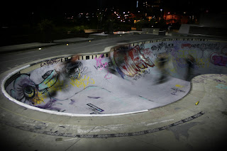
This is my favourite series of slow-shutter photos..
skateboardingmagazine.com/blog/2010/08/02/surreal-skate-park-after-dark
Tuesday, 22 March 2011
Main Objectives/ Themes
My main objectives for this assignment followed along these main themes…
Perspective. I wanted to show a different point of view. Not many people regularly see from behind a bar out to the crowd, as opposed to looking in. It’s a small insight into a bartender’s world. I also like how even less see it when all the customers are gone and there is only a used up space left, needing a good clean.
Distortion. The slight fisheye effect to the lens just gives the images an extra visual effect that ties in well with the placement of the camera- giving the feeling that there is someone watching, due to visual links to security camera footage. I also really like how the lens has given the bar a delicate curve (it is actually dead straight); it gives the images a slightly intoxicated effect.
Seen/ Unseen. I could have made my images lighter and easier to see, but I chose not to. A lot of people go to a bar or a club to get away and lose themselves for a night and I wanted to illustrate that in my images. I also like how, the more you look, the more you will see - especially with the big crowd photo. Everyone is either deep in their conversations or alcohol glaze (or both) and are completely oblivious to many of the people around them. This seems to dissect the image into different tiny moments in time, and the movement, body language and facial expressions of the people within them.
Glare. More so a visual effect than a theme, I worked with the glare of the coloured lights and the strong reflection on shiny surfaces instead of against them. I knew that with the low light, this was bound to happen. But instead of seeing it as a problem, I embraced it as an effect. I like how the lighting has effected the colouring so significantly, it adds real drama to the images and works well with the look and colour palette I was going for. I also really like all the reflection, like on the glasses and the stainless steel bar top – it speaks of a bar. Everything is always shiny, everything is always clean and this helps to show that.
Red. For me, red screams night and a colour for darkness. So instead of desaturating my images slightly and evening out the colour tone, I decided to accentuate it. Red speaks of the underground, the nightclubs, the bars, the concerts. It symbolises passion, lust, sin, sex, blood, anger, love.. strong feelings you seem to find floating around the air at venues such as these. So I kept the saturated look and opted for the drama. x
Red. For me, red screams night and a colour for darkness. So instead of desaturating my images slightly and evening out the colour tone, I decided to accentuate it. Red speaks of the underground, the nightclubs, the bars, the concerts. It symbolises passion, lust, sin, sex, blood, anger, love.. strong feelings you seem to find floating around the air at venues such as these. So I kept the saturated look and opted for the drama. x
Monday, 21 March 2011
Artist Model Four: Neil Creek
http://www.flickr.com/photos/neilcreek/2156538672/lightbox/
I was drawn to this photo due to the distortion created by the fish eye lens. x
I was drawn to this photo due to the distortion created by the fish eye lens. x
Artist Model Three: Shan

http://www.snapstar.co.nz/gallery.aspx?eid=6882&cid=10
I was inspired by the colour and the movement in this photograph. x
I was inspired by the colour and the movement in this photograph. x
Artist Model Two: InvincibleFX
I really like the blurred movement and colouring in this photograph. x
Artist Model One: Will Warr
With this photograph, I liked the smokey atmosphere
and how it shows the lighting well and silhouettes the crowd. x
Wednesday, 16 March 2011
Mini World
Mini World - Weekly Assignment
I wasn't convinced that the skate bowl was going to work..
Yet, with a little bit of manipulation it turned out ok. It looks
quite trippy, due to the fact that it is a con-caving skate bowl,
made to look like a convex world. x
Panorama - DAY
Panorama - Weekly Assignment
I like the perspective of this panorama. Although the graffiti on the
left and right is behind me whilst taking the photos- the panorama makes it look
like it is coming straight out. Its a cool effect. I also like the harsh
shadowing and the wash out highlights, it creates a great contrast. x
Subscribe to:
Posts (Atom)


